Introduction

There are many different calendars used throughout the world. This plugin aims to make them accessible in JavaScript in a consistent manner. The basic modules provide the underlying calendar support, while the picker module builds a generic datepicker on top of this functionality.

Use calendar:

$('#selectCalendar').change(function() {
	calendar = $.calendars.instance($(this).val());
	var convert = function(value) {
		return (!value || typeof value != 'object' ? value :
			calendar.fromJD(value.toJD()));
	};
	$('.is-calendarsPicker').each(function() {
		var current = $(this).calendarsPicker('option');
		$(this).calendarsPicker('option', {calendar: calendar,
				onSelect: null, onChangeMonthYear: null,
				defaultDate: convert(current.defaultDate),
				minDate: convert(current.minDate),
				maxDate: convert(current.maxDate)}).
			calendarsPicker('option',
				{onSelect: current.onSelect,
				onChangeMonthYear: current.onChangeMonthYear});
	});
});

A datepicker based on a calendar can easily be added as a popup to a text field or inline in a division or span with appropriate default settings. The popup shows when the field gains focus and is closed by clicking on the Close link or clicking anywhere else on the page. You can also remove the datepicker widget if it is no longer required.


Popup datepicker (input):  

Inline datepicker (div/span):  

$('#defaultPopup,#defaultInline').calendarsPicker();

$('.disablePicker').click(function() {
	var enable = $(this).text() === 'Enable';
	$(this).text(enable ? 'Disable' : 'Enable').
		siblings('.is-calendarsPicker').calendarsPicker(enable ? 'enable' : 'disable');
});

$('#removePicker').click(function() {
	var destroy = $(this).text() === 'Remove';
	$(this).text(destroy ? 'Re-attach' : 'Remove');
	$('#defaultPopup,#defaultInline').calendarsPicker(destroy ? 'destroy' : {});
});

The default settings are:

You can set defaults that apply to all datepicker instances as shown below:

$.calendarsPicker.setDefaults({pickerClass: 'my-picker'});

Processed fields are marked with a class of is-calendarsPicker and are not re-processed if targeted a second time.

Invocation

By default a popup datepicker appears when its input field gains focus. You can configure an external trigger in addition to or instead of the default. Clicking on the trigger toggles the popup open and closed.

Focus and button:  

$('#bothPicker').calendarsPicker({
	showTrigger: '<button type="button" class="trigger">...</button>'});

From a button only:  

$('#buttonPicker').calendarsPicker({showOnFocus: false,
	showTrigger: '<button type="button" class="trigger">' +
	'<img src="img/calendar.gif" alt="Popup"></button>'});

From an image only:  

$('#imagePicker').calendarsPicker({showOnFocus: false,
	showTrigger: '<img src="img/calendar.gif" alt="Popup" class="trigger">'});

Embedded image trigger:  

$('#embeddedPicker').calendarsPicker({showOnFocus: false,
	showTrigger: '#calImg'});
.embed + img { position: relative; left: -24px; top: 0px; }

You can also control the animation used to display the datepicker and its duration. There are three standard animations (show, fadeIn, slideDown) as well as the ones from the jQuery UI effects package. Additional options for the latter may be specified with the showOptions setting. Use '' for no animation.

Show :

$('#animDatepicker').calendarsPicker({showTrigger: '#calImg'});

var anims = ['show', 'fadeIn', 'slideDown', 'blind', 'blind', 'bounce', 'clip',
	'clip', 'drop', 'drop', 'fold', 'fold', 'slide', 'slide', ''];
var animOpts = [null, null, null, {}, {direction: 'horizontal'}, {}, {},
	{direction: 'horizontal'}, {}, {direction: 'up'}, {},
	{horizFirst: true}, {}, {direction: 'up'}, {}];

$('#speed,#animation').change(function() {
	var index = parseInt($('#animation').val(), 10);
	$('#animDatepicker').calendarsPicker('option', {showAnim: anims[index],
		showOptions: animOpts[index], showSpeed: $('#speed').val()});
});
Keyboard Equivalents

You can also drive the datepicker via the keyboard, as shown below, or enter a date directly into the input field.

In addition, if you include the MouseWheel plugin in your page, you can use the mouse wheel to move through the months or years (with the Ctrl key).

Keyboard equivalents:

$('#keyboardPicker').calendarsPicker({showTrigger: '#calImg'});
Date Formats

You can specify the format in which the date is to appear. Use a combination of the field formats below, with the default depending on the calendar used (being 'mm/dd/yyyy' for the Gregorian English calendar). You must quote (using ') any text that matches these formats to avoid it being replaced.

Or you can use one of the predefined formats:

Date format:


$('#formatPicker').calendarsPicker({showTrigger: '#calImg'});
	
var formats = ['mm/dd/yyyy', 'M d, yyyy', 'MM d, yyyy',
	'DD, MM d, yyyy', 'mm/dd/yy', 'dd/mm/yyyy',
	'mm/dd/yyyy (\'w\'w)', '\'Day\' d \'of\' MM, yyyy', calendar.ATOM,
	calendar.COOKIE, calendar.ISO_8601, calendar.JULIAN,
	calendar.RFC_822, calendar.RFC_850, calendar.RFC_1036,
	calendar.RFC_1123, calendar.RFC_2822, calendar.RSS,
	calendar.TICKS, calendar.TIMESTAMP, calendar.W3C];

$('#dateFormat').change(function() {
	$('#formatPicker').val('').calendarsPicker('option',
		{dateFormat: formats[$(this).val()]});
});
Getting and Setting Dates

You can retrieve or supply the date(s) for the datepicker by using the 'getDate' or 'setDate' commands. The dates are returned as an array (possibly empty) of CDate objects. When setting the dates you can provide one value, two values (for a range), or mutliple values in an array. Each value may be a CDate, the date as a string in the current date format, a number of days relative to today, or a string to specify one or more units and periods relative to today. For the last, use 'd' for days, 'w' for weeks, 'm' for months, or 'y' for years.

Popup single:

$('#getSetSinglePicker').calendarsPicker({showTrigger: '#calImg'});

Popup range:

$('#getSetRangePicker').calendarsPicker({
	rangeSelect: true, showTrigger: '#calImg'});

Popup multiple:

$('#getSetMultiPicker').calendarsPicker({
	multiSelect: 4, showTrigger: '#calImg'});

Inline multiple:

$('#getSetInlinePicker').calendarsPicker({
	multiSelect: 4, showTrigger: '#calImg'});

Get/set dates:


$('#getDates').click(function() {
	var dates = $('#' + $('#getSetSelect').val()).calendarsPicker('getDate');
	var value = '';
	for (var i = 0; i < dates.length; i++) {
		value += (i == 0 ? '' : ',') + dates[i].formatDate();
	}
	$('#getSetValue').val(value || 'none');
});

$('#setDates').click(function() {
	var dates = $('#getSetValue').val().split(',');
	$('#' + $('#getSetSelect').val()).calendarsPicker('setDate', dates);
});
Default Date

You can set the default date to display when no other is set in the datepicker. In addition, you can set this date to be automatically selected.

Without any modification, the default date is today. The default date can be set as an absolute date as either a CDate or a string (in the current date format). Or it may be set as a relative value by using a simple number to offset from today's date a given number of days, or a string to specify one or more units and periods. Use 'd' for days, 'w' for weeks, 'm' for months, or 'y' for years.

Actual date - January 1, 2014:

$('#defaultActualPicker').calendarsPicker({
	defaultDate: calendar.newDate(2014, 1, 1), showTrigger: '#calImg'});

Date string - January 1, 2014:

$('#defaultDatePicker').calendarsPicker({
	defaultDate: '01/01/2014', showTrigger: '#calImg'});

Seven days ahead:

$('#defaultNumPicker').calendarsPicker({
	defaultDate: +7, showTrigger: '#calImg'});

Two weeks ahead:

$('#defaultStr1Picker').calendarsPicker({
	defaultDate: '+2w', showTrigger: '#calImg'});

One month and ten days ahead:

$('#defaultStr2Picker').calendarsPicker({
	defaultDate: '+1m +10d', showTrigger: '#calImg'});

Select default date:

$('#selectDefaultPicker').calendarsPicker({
	defaultDate: '-1w', selectDefaultDate: true, showTrigger: '#calImg'});
Minimum and Maximum Dates

You can set minimum and/or maximum dates within which a date may be chosen. These dates can be set as an absolute date as either a CDate or a string (in the current date format). Or they may be set as relative values by using a simple number to offset from today's date a given number of days, or a string to specify one or more units and periods. Use 'd' for days, 'w' for weeks, 'm' for months, or 'y' for years.

Jan 1, 2011 to Jan 1, 2013:

$('#minmaxPicker').calendarsPicker({
	minDate: calendar.newDate(2011, 1, 26),
	maxDate: calendar.newDate(2013, 1, 26), showTrigger: '#calImg'});

As date strings:

$('#minmax2Picker').calendarsPicker({
	minDate: '01/26/2011', maxDate: '01/26/2013', showTrigger: '#calImg'});

Seven days ago to 30 days ahead:

$('#minmaxNumPicker').calendarsPicker({
	minDate: -7, maxDate: +30, showTrigger: '#calImg'});

Two weeks ago to one month, two weeks, three days ahead:

$('#minmaxStrPicker').calendarsPicker({
	minDate: '-2w', maxDate: '+1m +2w +3d', showTrigger: '#calImg'});
Day-by-day Modifications

You have some control over the behaviour and style of individual days shown in the datepicker by preventing days being selected, by changing their style, by changing their description, or by replacing the cell content. The onDate function is called for each day shown and returns an object with (optionally) a selectable flag (selectable), any CSS styles (dateClass), a description (title), and /or new content (content). If you need multiple onShow functions, use the $.calendarsPicker.multipleEvents function and pass the relevant handlers to it.

Weekends not selectable: See the Extensions tab.

National days (CSS):

$('#nationalPicker').calendarsPicker({
	onDate: nationalDays, showTrigger: '#calImg'});

var natDays = [[1, 26, 'au'], [2, 6, 'nz'], [3, 17, 'ie'], [4, 27, 'za'],
	[5, 25, 'ar'], [6, 6, 'se'], [7, 4, 'us'], [8, 17, 'id'],
	[9, 7, 'br'], [10, 1, 'cn'], [11, 22, 'lb'], [12, 12, 'ke']];

function nationalDays(date, inMonth) {
	if (inMonth) {
    	for (i = 0; i < natDays.length; i++) {
        	if (date.month() == natDays[i][0] && date.day() == natDays[i][1]) {
            	return {dateClass: natDays[i][2] + '_day', selectable: false};
        	}
    	}
	}
    return {};
}
.ar_day { text-indent: -9999px; background: #eee url(ar.gif) no-repeat center; }
.au_day { text-indent: -9999px; background: #eee url(au.gif) no-repeat center; }
...

Highlight today (tooltip): Hover over today.

$('#tooltipTodayPicker').calendarsPicker({
	onDate: tooltipToday, showTrigger: '#calImg'});

function tooltipToday(date) {
    return {title: (date.compareTo(date.calendar().today()) == 0 ?
		'Select today' : date.formatDate('Select DD, M d, yyyy'))};
}

Day of year in content:

$('#dayOfYearPicker').calendarsPicker({
	onDate: showDayOfYear, showTrigger: '#calImg'});

function showDayOfYear(date) {
    return {content: date.day() + '<br><sub>' + date.dayOfYear() + '</sub>',
		dateClass: 'showDoY'};
}
.showDoY { height: 2.5em; line-height: 1em; }
Date Ranges

The datepicker can be configured to allow the selection of a date range within the one picker. The first click selects the start of the range and the second selects the end.

Date range:

$('#rangePicker').calendarsPicker({
	rangeSelect: true, showTrigger: '#calImg'});

Date range showing two months:

$('#range2Picker').calendarsPicker({
	rangeSelect: true, monthsToShow: 2, showTrigger: '#calImg'});

Inline range showing six months:

$('#rangeInlinePicker').calendarsPicker({
	rangeSelect: true, monthsToShow: [2, 3]});

Date range with minimum/maximum:

$('#rangeMinMaxPicker').calendarsPicker({rangeSelect: true,
	minDate: -7, maxDate: '+1y', showTrigger: '#calImg'});

Date range with no weekends:

$('#rangeNoWeekendPicker').calendarsPicker({
	rangeSelect: true, onDate: $.calendarsPicker.noWeekends,
	showTrigger: '#calImg'});

Date range with separate fields: to

$('#startPicker,#endPicker').calendarsPicker({
	onSelect: customRange, showTrigger: '#calImg'});
	
function customRange(dates) {
    if (this.id == 'startPicker') {
		$('#endPicker').calendarsPicker('option', 'minDate', dates[0] || null);
	}
	else {
		$('#startPicker').calendarsPicker('option', 'maxDate', dates[0] || null);
	}
}
Multiple Dates

The datepicker can be configured to allow the selection of multiple individual dates. Clicking on an already selected date de-selects it. The datepicker automatically closes when the maximum number of allowed dates has been chosen.

Two separate dates:

$('#multi2Picker').calendarsPicker({
	multiSelect: 2, showTrigger: '#calImg'});

Four separate dates:

$('#multi4Picker').calendarsPicker({
	multiSelect: 4, multiSeparator: '+', showTrigger: '#calImg'});

"Unlimited" dates:

$('#multi999Picker').calendarsPicker({
	multiSelect: 999, monthsToShow: 2, showTrigger: '#calImg'});

Three dates inline:

$('#multiInlinePicker').calendarsPicker({
	multiSelect: 3, monthsToShow: 3, monthsToStep: 3,
	prevText: '<Prev months', nextText: 'Next months>'});
Controls and Navigation

Modify the controls and month/year navigation, as shown below. Control inclusion and/or placement are defined in the renderer for the datepicker. Thereafter, several settings affect their appearance.

You can override parts of the default renderer by creating a new empty renderer and extending it with the default values and then the overridden ones.

Controls as buttons:

$('#controlsPicker').calendarsPicker({
	renderer: $.extend({}, $.calendarsPicker.defaultRenderer,
		{picker: $.calendarsPicker.defaultRenderer.picker.
			replace(/\{link:clear\}/, '{button:clear}').
			replace(/\{link:close\}/, '{button:close}')}),
	showTrigger: '#calImg'});

Show icons for controls:

$('#iconsPicker').calendarsPicker({prevText: '<img src="img/prev.gif">',
	todayText: '<img src="img/current.gif">',
	nextText: '<img src="img/next.gif">',
	clearText: '<img src="img/clear.gif">',
	closeText: '<img src="img/close.gif">',
	showTrigger: '#calImg'});

Mandatory date - remove Clear:

$('#mandatoryPicker').calendarsPicker({
	renderer: $.extend({}, $.calendarsPicker.defaultRenderer,
		{picker: $.calendarsPicker.defaultRenderer.picker.
			replace(/\{link:clear\}/, '')}),
	showTrigger: '#calImg'});

Alternate mandatory date (CSS):

$('#mandatory2Picker').calendarsPicker({
	pickerClass: 'mandatory', showTrigger: '#calImg'});
.mandatory .calendars-cmd-clear { display: none; }

Hide Prev/Next if not available:

$('#noPrevNextPicker').calendarsPicker({pickerClass: 'noPrevNext',
	minDate: -20, maxDate: +20, showTrigger: '#calImg'});
.noPrevNext .calendars-cmd.calendars-disabled { visibility: hidden; }

Prev/Next as months:

$('#prevNextFormatPicker').calendarsPicker({commandsAsDateFormat: true,
	prevText: '< M', todayText: 'M y', nextText: 'M >',
	showTrigger: '#calImg'});

Show yearly Prev/Next controls:

$('#yearPrevNextPicker').calendarsPicker({pickerClass: 'calendars-jumps',
	renderer: $.extend({}, $.calendarsPicker.defaultRenderer,
		{picker: $.calendarsPicker.defaultRenderer.picker.
			replace(/\{link:prev\}/, '{link:prevJump}{link:prev}').
			replace(/\{link:next\}/, '{link:nextJump}{link:next}')}),
	showTrigger: '#calImg'});
.calendars-jumps .calendars-cmd-prev, .calendars-jumps .calendars-cmd-next { width: 20%; }

Show large Prev/Next moving six months:

$('#month6PrevNextPicker').calendarsPicker({
	monthsToJump: 6, pickerClass: 'calendars-jumps',
	prevJumpStatus: 'Back 6 months', nextJumpStatus: 'Ahead 6 months',
	renderer: $.extend({}, $.calendarsPicker.defaultRenderer,
		{picker: $.calendarsPicker.defaultRenderer.picker.
			replace(/\{link:prev\}/, '{link:prevJump}{link:prev}').
			replace(/\{link:next\}/, '{link:nextJump}{link:next}')}),
	showTrigger: '#calImg'});

Replace 'Today' with 'Current':

$('#currentPicker').calendarsPicker({
	renderer: $.extend({}, $.calendarsPicker.defaultRenderer,
		{picker: $.calendarsPicker.defaultRenderer.picker.
			replace(/\{link:today\}/, '{link:current}')}),
	showTrigger: '#calImg'});
Commands

Controls appearing on the datepicker are defined as commands - encapsulating the displayed text, a triggering keystroke, whether or not it is enabled, a representative date, and the actual action itself. They are positioned in the renderer as substitution points of the form '{link:name}' or '{button:name}', depending on whether they are to show as links or buttons.

You can override parts of the default commands by creating a new empty command object and extending it with the default values ($.calendarsPicker.commands) and then the overridden settings.

Change keystrokes (Alt+Page Up/Down):

var altCommands = $.extend(true, {}, $.calendarsPicker.commands);
altCommands.prevJump.keystroke = {keyCode: 33, altKey: true}; // Alt+PageUp
altCommands.nextJump.keystroke = {keyCode: 34, altKey: true}; // Alt+PageDown

$('#keystrokePicker').calendarsPicker({
	commands: altCommands, showTrigger: '#calImg'});

You can also define an entirely new command and add it to the datepicker.

New command - 'Millenium':

var newCommands = $.extend({}, $.calendarsPicker.commands);
newCommands.millenium = {
	text: 'milleniumText', status: 'milleniumStatus',
	keystroke: {keyCode: 112, shiftKey: true}, // Shift+F1
	enabled: function(inst) { return true; },
	date: function(inst) {
		return inst.drawDate.newDate(2001, 1, 1); },
	action: function(inst) {
		$.calendarsPicker.showMonth(this, 2001, 1, 1); }
};

$('#commandPicker').calendarsPicker({commands: newCommands,
	renderer: $.extend({}, $.calendarsPicker.defaultRenderer,
		{picker: $.calendarsPicker.defaultRenderer.picker.
			replace(/\{link:today\}/, '{link:millenium}')}),
	milleniumText: 'Millenium', milleniumStatus: 'Start of the millenium',
	showTrigger: '#calImg'});
Month and Year Selection

Determine whether or not the month and year may be directly selected. Specify which years appear in the drop-down - by default it shows 10 years before and after the currently selected date.

Note that the yearRange setting only applies to the year drop-down. It does not restrict date selection directly. You must still provide minDate and/or maxDate settings if restrictions apply.

No month/year selection:

$('#monthYearDatepicker').calendarsPicker({
	changeMonth: false, showTrigger: '#calImg'});

Show -5 to +5 years:

$('#yearsRelPicker').calendarsPicker({
	yearRange: 'c-5:c+5', showTrigger: '#calImg'});

Show years 1980 to 2010:

$('#yearsAbsPicker').calendarsPicker({
	minDate: calendar.newDate(1980, 1, 1), maxDate: calendar.newDate(2010, 12, 31),
	yearRange: '1980:2010', showTrigger: '#calImg'});

Show 1980 to 18 years ago:

$('#yearsMixedPicker').calendarsPicker({
	minDate: calendar.newDate(1980, 1, 1), maxDate: '-18y',
	yearRange: '1980:-18', showTrigger: '#calImg'});

Descending order:

$('#yearsDescPicker').calendarsPicker({
	minDate: calendar.newDate(1990, 1, 1), maxDate: calendar.newDate(2010, 12, 31),
	yearRange: '2010:1990', showTrigger: '#calImg'});

Show unlimited years:

$('#yearsAnyPicker').calendarsPicker({
	yearRange: 'any', showTrigger: '#calImg'});
Month display

Modify the display of each month, as shown below.

Show days from other months:

$('#otherMonthsPicker').calendarsPicker({
	showOtherMonths: true, showTrigger: '#calImg'});

Select days from other months:

$('#selectOtherPicker').calendarsPicker({
	showOtherMonths: true, selectOtherMonths: true,
	showTrigger: '#calImg'});

Show three months:

$('#months3Picker').calendarsPicker({
	monthsToShow: 3, monthsToStep: 3, showTrigger: '#calImg'});

Show three months with current in the middle:

$('#months3MiddlePicker').calendarsPicker({
	monthsToShow: 3, monthsToStep: 3, monthsOffset: 1,
	showTrigger: '#calImg'});

Show three months ending at current one:

$('#months3LastPicker').calendarsPicker({
	monthsToShow: 3, monthsToStep: 3, monthsOffset: 2,
	showTrigger: '#calImg'});
Miscellaneous

Various other behaviours are available, as shown below.

Auto size for :

$('#sizePicker').calendarsPicker({
	autoSize: true, showTrigger: '#calImg'});
	
$('#selectSize').change(function() {
	$('#sizePicker').calendarsPicker('option', {dateFormat: $(this).val()});
});

Alignment :

$('#alignmentPicker').calendarsPicker({showTrigger: '#calImg'});
	
$('#selectAlignment').change(function() {
	$('#alignmentPicker').calendarsPicker('option', {alignment: $(this).val()});
});

Alternate field and format:

$("#altPicker").calendarsPicker({dateFormat: 'D d MM, yyyy',
	altField: '#altOutput', altFormat: 'yyyy-mm-dd',
	showTrigger: '#calImg'});

No mousewheel navigation:

$('#noWheelPicker').calendarsPicker({
	useMouseWheel: false, showTrigger: '#calImg'});

Textarea with multiple dates:

$('#textPicker').calendarsPicker({
	multiSelect: 999, multiSeparator: ', ', showTrigger: '#calImg'});

Linked to drop-downs:

// Update three select controls to match a datepicker selection
function updateSelected(dates) {
    $('#selectedMonth').val(dates.length ? dates[0].month() : '');
    $('#selectedDay').val(dates.length ? dates[0].day() : '');
    $('#selectedYear').val(dates.length ? dates[0].year() : '');
}

$('#selectedPicker').calendarsPicker({
	minDate: '01/01/2001', maxDate: '12/31/2010',
	alignment: 'bottomRight', onSelect: updateSelected,
	showTrigger: '#calImg'});

// Update datepicker from three select controls
$('#selectedMonth,#selectedDay,#selectedYear').change(function() {
	$('#selectedPicker').calendarsPicker('setDate', calendar.newDate(
		$('#selectedYear').val(), $('#selectedMonth').val(),
		$('#selectedDay').val()));
});

Linked to inputs: / /

// Update three input controls to match a datepicker selection
function updateLinked(dates) {
    $('#linkedMonth').val(dates.length ? dates[0].month() : '');
    $('#linkedDay').val(dates.length ? dates[0].day() : '');
    $('#linkedYear').val(dates.length ? dates[0].year() : '');
}

$('#linkedPicker').calendarsPicker({
	alignment: 'bottomRight', onSelect: updateLinked,
	showTrigger: '#calImg'});

// Update datepicker from three input controls
$('#linkedMonth,#linkedDay,#linkedYear').change(function() {
	$('#linkedPicker').calendarsPicker('setDate', calendar.newDate(
		parseInt($('#linkedYear').val(), 10),
		parseInt($('#linkedMonth').val(), 10),
		parseInt($('#linkedDay').val(), 10)));
});
Events

There are several event hooks in the datepicker to allow you respond to user actions.

Select:

$('input[name=usePicker]').click(function() {
	$('#events .is-calendarsPicker').calendarsPicker('option', {
		rangeSelect: $('#useRange').is(':checked'),
		multiSelect: $('#useMulti').is(':checked') ? 2 : 0});
});

On change month/year:

$('#onChangePicker').calendarsPicker({
	onChangeMonthYear: function(year, month) {
		alert('Moving to month ' + month + '/' + year); },
	showTrigger: '#calImg'});

On hover: See the Extensions tab.

On selection:

$('#onSelectPicker').calendarsPicker({
	onSelect: function(dates) { alert('The chosen date(s): ' + dates); },
	showTrigger: '#calImg'});

On close:

$('#onClosePicker').calendarsPicker({
	onClose: function(dates) { alert('Closed with date(s): ' + dates); },
	showTrigger: '#calImg'});
Datepicker Extensions

The picker.ext module provides additional functionality to extend the datepicker. These include onShow callbacks that enhance the datepicker. If you need multiple onShow functions, use the $.calendarsPicker.multipleEvents function and pass the relevant handlers to it.

Weekends not selectable:

$('#noWeekendsPicker').calendarsPicker({
	onDate: $.calendarsPicker.noWeekends, showTrigger: '#calImg'});

Change first day of the week: Click on a day header.

$('#firstDayPicker').calendarsPicker({
	onShow: $.calendarsPicker.changeFirstDay, showTrigger: '#calImg'});

Highlight the hovered week:

$('#highlightWeekPicker').calendarsPicker({
	onShow: $.calendarsPicker.highlightWeek, showTrigger: '#calImg'});

Respond to date hovering: You're looking at nothing.

$('#hoverPicker').calendarsPicker({
	onShow: $.calendarsPicker.hoverCallback(showHover), showTrigger: '#calImg'});
	
function showHover(date, selectable) {
	$('#hoverOutput').text((selectable ? date.formatDate() : null) || 'nothing');
}

Show status bar:

$('#statusPicker').calendarsPicker({
	onShow: $.calendarsPicker.showStatus, showTrigger: '#calImg'});

Show week of the year (calendar default):

$('#showWeekPicker').calendarsPicker({
	renderer: $.calendarsPicker.weekOfYearRenderer,
	firstDay: 1, showOtherMonths: true, showTrigger: '#calImg'});

Show week of the year (custom):

$('#customWeekPicker').calendarsPicker({
	renderer: $.calendarsPicker.weekOfYearRenderer,
	calculateWeek: customWeek, firstDay: 1,
	showOtherMonths: true, showTrigger: '#calImg'});

function customWeek(date) {
	return Math.floor((date.dayOfYear() - 1) / 7) + 1;
}

Month navigation:

$('#monthNavPicker').calendarsPicker({changeMonth: false,
	onShow: $.calendarsPicker.monthNavigation, showTrigger: '#calImg'});

Select the entire week: Click on the week number.

$('#selectWeekPicker').calendarsPicker({
	renderer: $.calendarsPicker.weekOfYearRenderer,
	firstDay: 1, showOtherMonths: true, rangeSelect: true,
	onShow: $.calendarsPicker.selectWeek, showTrigger: '#calImg'});

Select a month only:

$('#selectMonthPicker').calendarsPicker({
	onShow: $.calendarsPicker.monthOnly, showTrigger: '#calImg'});

Combination:

$('#multiShowPicker').calendarsPicker({
	renderer: $.calendarsPicker.weekOfYearRenderer,
	firstDay: 1, showOtherMonths: true, rangeSelect: true,
	onShow: $.calendarsPicker.multipleEvents(
		$.calendarsPicker.selectWeek, $.calendarsPicker.showStatus),
	showTrigger: '#calImg'});
Inline Configuration

Instead of configuring fields via parameters to the datepicker instantiation, you can specify them inline. You must add the jQuery Metadata plugin to your page and then encode the settings in the class attribute (by default).

Inline configuration:

<input type="text" id="configPicker" size="10"
	class="{showOtherMonths: true, firstDay: 1, dateFormat: 'yyyy-mm-dd',
	minDate: calendar.newDate(2012, 12, 25)}">
$('#configPicker').calendarsPicker({
	showTrigger: '#calImg'});
Localisation

Note that the localisations listed here only apply to the Gregorian and Julian calendars, although some localisations are also available for the other calendars.

You can localise the datepicker for other languages and regional differences (over 70 now available). The datepicker defaults to English with a date format of mm/dd/yyyy. Select a language for the datepicker.

:  
 

$('#l10nPicker').calendarsPicker($.extend({showTrigger: '#calImg',
	altField: '#l10nAlternate', altFormat: 'DD, d MM, yyyy', localNumbers: true},
	$.calendarsPicker.regionalOptions['fr']));
	
$('#l10nLanguage').change(function() {
	var language = $(this).val();
	$.localise(['js/jquery.calendars', 'js/jquery.calendars.picker'], language);
	$('#l10nPicker').calendarsPicker('option', $.extend(
		{calendar: $.calendars.instance(
			calendar.name == 'Julian' ? 'julian' : 'gregorian', language)},
		$.calendarsPicker.regionalOptions[language]));
	$.calendarsPicker.setDefaults($.calendarsPicker.regionalOptions['']);
});
	
$('#l10nNumbers').change(function() {
	$('#l10nPicker').calendarsPicker('option', 'localNumbers', $(this).is(':checked'));
});

Some localisations read right-to-left.

:  
 

$('#rtlPicker').calendarsPicker($.extend({showTrigger: '#calImg',
	altField: '#rtlAlternate', altFormat: 'DD, d MM, yyyy', localNumbers: true},
	$.calendarsPicker.regionalOptions['ar']));
	
$('#rtlLanguage').change(function() {
	var language = $(this).val();
	$.localise(['js/jquery.calendars', 'js/jquery.calendars.picker'], language);
	$('#rtlPicker').calendarsPicker('option', $.extend(
		{calendar: $.calendars.instance(
			calendar.name == 'Julian' ? 'julian' : 'gregorian', language)},
		$.calendarsPicker.regionalOptions[language]));
	$.calendarsPicker.setDefaults($.calendarsPicker.regionalOptions['']);
});
	
$('#rtlNumbers').change(function() {
	$('#rtlPicker').calendarsPicker('option', 'localNumbers', $(this).is(':checked'));
});

You need to load the appropriate language packages for both the underlying calendar and for the datepicker. The latter adds a language set ($.calendarsPicker.regionalOptions[langCode]) and automatically sets this language as the default for all datepicker fields.

<script type="text/javascript" src="jquery.calendars-fr.js"></script>
<script type="text/javascript" src="jquery.calendars.picker-fr.js"></script>

Thereafter, if desired, you can restore the original language settings.

$.calendarsPicker.setDefaults($.calendarsPicker.regionalOptions['']);

And then configure the language per datepicker field, remembering to localise the underlying calendar as well. You can also localise the appearance of the numbers in the calendar, when the selected localisation supports it, by setting the localNumbers option to true.

$('#l10nPicker').calendarsPicker($.extend(
	{calendar: $.calendars.instance('gregorian', 'fr')},
	$.calendarsPicker.regionalOptions['fr']));
Datepicker Layout and Styling

The datepicker uses a templating mechanism to render its layout. So it is easy to change the structure of the datepicker to suit your needs: from minor changes such as adding or removing controls, to major adjustments that drastically alter its appearance. Combine the layout with appropriate CSS to create your datepicker.

Month to a line:

$('#listRender').calendarsPicker({monthsToShow: [6, 1], showOtherMonths: true,
	onSelect: function(date) { alert('You picked ' + date); },
	renderer: {picker: '<div><ul class="days">' +
		'{weekHeader}{weekHeader}{weekHeader}{weekHeader}{weekHeader}{weekHeader}' +
		'</ul><div>{months}</div></div>',
		monthRow: '<div>{months}</div>',
		month: '<div class="month"><div>{monthHeader:M yyyy}</div><ul>{weeks}</ul></div>',
		weekHeader: '{days}',
		dayHeader: '<li>{day}</li>',
		week: '{days}',
		day: '<li>{day}</li>',
		monthSelector: '.month',
		daySelector: 'li',
		rtlClass: 'rtl',
		multiClass: 'multi',
		defaultClass: 'default',
		selectedClass: 'selected',
		highlightedClass: 'highlight',
		todayClass: 'today',
		otherMonthClass: 'other-month',
		weekendClass: 'weekend',
		commandClass: 'cmd-',
		disabledClass: 'disabled'}});
#listRender { font-size: 11px; }
#listRender .month { clear: left; border: none;
	border-right: 1px solid #ccc; text-align: center; }
#listRender .month div { float: left; width: 9.5em;
	padding-right: 0.5em; text-align: right; }
#listRender ul { float: left; margin: 0em; padding: 0em;
	list-style: none; overflow: hidden; }
#listRender ul.days { margin-left: 10em; text-align: center; }
#listRender ul.days span { background-color: #777; color: #fff; }
#listRender li { float: left; width: 1.75em; margin: 0em; border: 1px solid #aaa; }
#listRender li a { display: block; width: 100%; padding: 0.125em;
	background-color: #eee; color: #000; text-decoration: none; }
#listRender li span { display: block; width: 100%; padding: 0.125em;
	background-color: #fff; color: #888; }
#listRender li .weekend { background-color: #ddd; }
#listRender li .highlight { background-color: #f08080; }
#listRender li .selected { background-color: #777; }

You can tweak the styling of a particular datepicker by providing a pickerClass setting that is added to that instance as a CSS class.

Individualise styling:

$('#classPicker').calendarsPicker({
	pickerClass: 'myPicker', showTrigger: '#calImg'});
.myPicker .calendars-month-header,
.myPicker .calendars-month-header select { background-color: #f00; }

Or change the appearance of all datepickers with a different stylesheet by including it in your page:

<link rel="stylesheet" type="text/css" href="css/jquery.calendars.picker.css">

Alternate stylesheets:


$('#stylePopup').calendarsPicker({showOtherMonths: true, firstDay: 1,
	renderer: $.extend({}, $.calendarsPicker.weekOfYearRenderer,
		{picker: $.calendarsPicker.defaultRenderer.picker.
			replace(/\{link:clear\}/, '{button:clear}').
			replace(/\{link:close\}/, '{button:close}')}),
	onShow: $.calendarsPicker.showStatus, showTrigger: '#calImg'});
$('#styleInline').calendarsPicker({
	monthsToShow: 2, showOtherMonths: true, firstDay: 1,
	renderer: $.calendarsPicker.weekOfYearRenderer,
	onShow: $.calendarsPicker.showStatus});

$('#styleSelect').change(function() {
	$('#theme').attr('href', 'css/' + $(this).val());
	setTimeout(function() { // Refresh
		$('.inlinePicker').calendarsPicker('option'); }, 0);
});

The picker.ext module also defines a renderer that produces the standard structure, but using the ThemeRoller classes to help blend your datepicker with other jQuery UI components. Don't forget to load the appropriate ThemeRoller CSS, along with the corresponding local overrides:

<link rel="stylesheet" type="text/css" href="themes/south-street/jquery-ui.css">
<link rel="stylesheet" type="text/css" href="css/ui-south-street.calendars.picker.css">

ThemeRoller look-and-feel:


$('#themeRollerPopup').calendarsPicker({pickerClass: 'demo',
	renderer: $.calendarsPicker.themeRollerRenderer, showTrigger: '#calImg'});
		
$('#themeRollerInline').calendarsPicker({
	monthsToShow: [2, 3], showOtherMonths: true,
	renderer: $.calendarsPicker.themeRollerRenderer});
	
$('#themeRollerSelect').change(function() {
	$('#themeUI').attr('href', 'themesDemo/' + $(this).val() + '/jquery-ui.css');
	$('#themeTR').attr('href', 'css/ui-' + $(this).val() + '.calendars.picker.css');
});
Validation Integration

Datepicker can be integrated with Jörn Zaefferer's validation plugin by adding the jquery.calendars.validation.js extension to your page. One new validation is defined (cpDate) for basic date checking. It automatically handles date ranges and multiple dates, checks against any minDate and/or maxDate settings, and calls any onDate callback to verify selectability. It may be added as a class to your datepicker fields, or may be defined in the validate settings.

Another new validation (cpCompareDate) lets you compare one date field against another date - either the value of another datepicker field, a specific date, or today.

There is also a custom errorPlacement function defined so that the error messages appear after any trigger button or image (or before them if using a right-to-left localisation).

You can override the validation error messages through the messages setting of the validation plugin, or globally via the datepicker setDefaults function with any or all of the following settings: validateDate, validateDateMin, validateDateMax, validateDateMinMax, validateDateCompare, validateDateToday, validateDateOther, validateDateEQ, validateDateNE, validateDateLT, validateDateGT, validateDateLE, validateDateGE.
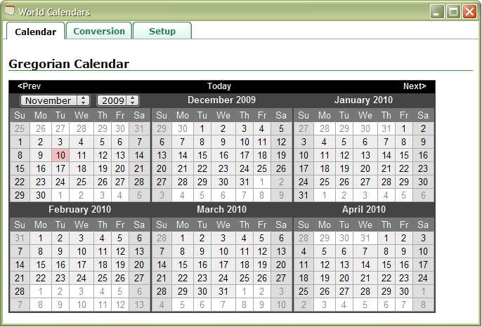
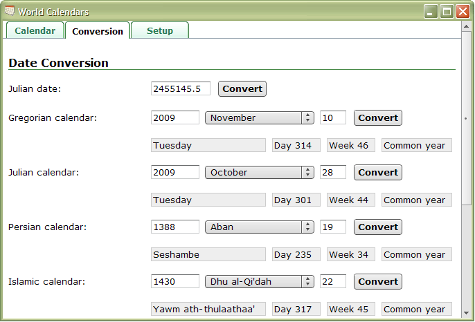
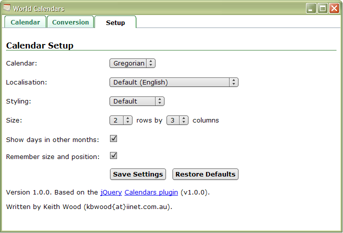
$('#validateForm').validate({
	errorPlacement: $.calendarsPicker.errorPlacement,
	rules: {
		validFormatPicker: {
			required: true,
			cpDate: true
		},
		validBeforePicker: {
			cpCompareDate: ['before', '#validAfterPicker']
		},
		validAfterPicker: {
			cpCompareDate: {after: '#validBeforePicker'}
		},
		validTodayPicker: {
			cpCompareDate: 'ne today'
		},
		validSpecificPicker: {
			cpCompareDate: 'notBefore 01/01/2012'
		}
	},
	messages: {
		validFormatPicker: 'Please enter a valid date (yyyy-mm-dd)',
		validRangePicker: 'Please enter a valid date range',
		validMultiPicker: 'Please enter at most three valid dates',
		validAfterPicker: 'Please enter a date after the previous value'
	}});

Validate date:

$('#validDefaultPicker').calendarsPicker({showTrigger: '#calImg'});

Validate alternate format:

$('#validFormatPicker').calendarsPicker({
	dateFormat: 'yyyy-mm-dd', showTrigger: '#calImg'});

Validate right-to-left:

$('#validRTLPicker').calendarsPicker({
	isRTL: true, showTrigger: '#calImg'});

Validate date range:

$('#validRangePicker').calendarsPicker({
	rangeSelect: true, showTrigger: '#calImg'});

Validate multiple dates:

$('#validMultiPicker').calendarsPicker({
	multiSelect: 3, showTrigger: '#calImg'});

Validate minimum:

$('#validMinPicker').calendarsPicker({
	minDate: -7, showTrigger: '#calImg'});

Validate maximum:

$('#validMaxPicker').calendarsPicker({
	maxDate: +7, showTrigger: '#calImg'});

Validate min/max:

$('#validMinMaxPicker').calendarsPicker({
	minDate: -7, maxDate: +7, showTrigger: '#calImg'});

Comparison before/after: to

$('#validBeforePicker,#validAfterPicker').calendarsPicker({
	showTrigger: '#calImg'});

Comparison not today:

$('#validTodayPicker').calendarsPicker({showTrigger: '#calImg'});

Comparison specific date:

$('#validSpecificPicker').calendarsPicker({showTrigger: '#calImg'});


AIR Application

The calendars and datepicker are available as a standalone AIR application. It displays a number of months and lets you configure which calendar to use, its localisation, its styling, and a few other items. You can also convert between dates in the various calendars.

World Calendars - AIR World Calendars - Convert World Calendars - Setup

In the Wild

This tab highlights examples of this plugin in use "in the wild".

To add another example, please contact me (wood.keith{at}optusnet.com.au) and provide the plugin name, the URL of your site, its title, and a short description of its purpose and where/how the plugin is used.

Quick Reference

A full list of all possible settings is shown below. Note that not all would apply in all cases. For more detail see the documentation reference page.

$(selector).calendarsPicker({
	calendar: $.calendars.instance(), // The calendar to use
	pickerClass: '', // CSS class to add to this instance of the datepicker
	showOnFocus: true, // True for popup on focus, false for not
	showTrigger: null, // Element to be cloned for a trigger, null for none
	showAnim: 'show', // Name of jQuery animation for popup, '' for no animation
	showOptions: {}, // Options for enhanced animations
	showSpeed: 'normal', // Duration of display/closure
	popupContainer: null, // The element to which a popup calendar is added, null for body
	alignment: 'bottom', // Alignment of popup - with nominated corner of input:
		// 'top' or 'bottom' aligns depending on language direction,
		// 'topLeft', 'topRight', 'bottomLeft', 'bottomRight'
	fixedWeeks: false, // True to always show 6 weeks, false to only show as many as are needed
	firstDay: null, // First day of the week, 0 = Sunday, 1 = Monday, ...
		// defaults to calendar local setting if null
	calculateWeek: null, // Calculate week of the year from a date, null for calendar default
	localNumbers: false, // True to localise numbers (if available),
		// false to use normal Arabic numerals
	monthsToShow: 1, // How many months to show, cols or [rows, cols]
	monthsOffset: 0, // How many months to offset the primary month by
	monthsToStep: 1, // How many months to move when prev/next clicked
	monthsToJump: 12, // How many months to move when large prev/next clicked
	changeMonth: true, // True to change month/year via drop-down, false for navigation only
	yearRange: 'c-10:c+10', // Range of years to show in drop-down: 'any' for direct text entry
		// or 'start:end', where start/end are '+-nn' for relative to today
		// or 'c+-nn' for relative to the currently selected date
		// or 'nnnn' for an absolute year
	showOtherMonths: false, // True to show dates from other months, false to not show them
	selectOtherMonths: false, // True to allow selection of dates from other months too
	defaultDate: null, // Date to show if no other selected
	selectDefaultDate: false, // True to pre-select the default date if no other is chosen
	minDate: null, // The minimum selectable date
	maxDate: null, // The maximum selectable date
	dateFormat: null, // Format for dates, defaults to calendar setting if null
	autoSize: false, // True to size the input field according to the date format
	rangeSelect: false, // Allows for selecting a date range on one date picker
	rangeSeparator: ' - ', // Text between two dates in a range
	multiSelect: 0, // Maximum number of selectable dates, zero for single select
	multiSeparator: ',', // Text between multiple dates
	onDate: null, // Callback as a date is added to the datepicker
	onShow: null, // Callback just before a datepicker is shown
	onChangeMonthYear: null, // Callback when a new month/year is selected
	onSelect: null, // Callback when a date is selected
	onClose: null, // Callback when a datepicker is closed
	altField: null, // Alternate field to update in synch with the datepicker
	altFormat: null, // Date format for alternate field, defaults to dateFormat
	constrainInput: true, // True to constrain typed input to dateFormat allowed characters
	commandsAsDateFormat: false, // True to apply formatDate to the command texts
	commands: this.commands, // Command actions that may be added to a layout by name

	// Localisation settings
	renderer: this.defaultRenderer, // The rendering templates
	prevText: '<Prev', // Text for the previous month command
	prevStatus: 'Show the previous month', // Status text for the previous month command
	prevJumpText: '<<', // Text for the previous year command
	prevJumpStatus: 'Show the previous year', // Status text for the previous year command
	nextText: 'Next>', // Text for the next month command
	nextStatus: 'Show the next month', // Status text for the next month command
	nextJumpText: '>>', // Text for the next year command
	nextJumpStatus: 'Show the next year', // Status text for the next year command
	currentText: 'Current', // Text for the current month command
	currentStatus: 'Show the current month', // Status text for the current month command
	todayText: 'Today', // Text for the today's month command
	todayStatus: 'Show today\'s month', // Status text for the today's month command
	clearText: 'Clear', // Text for the clear command
	clearStatus: 'Clear all the dates', // Status text for the clear command
	closeText: 'Close', // Text for the close command
	closeStatus: 'Close the datepicker', // Status text for the close command
	yearStatus: 'Change the year', // Status text for year selection
	monthStatus: 'Change the month', // Status text for month selection
	weekText: 'Wk', // Text for week of the year column header
	weekStatus: 'Week of the year', // Status text for week of the year column header
	dayStatus: 'Select DD, M d, yyyy', // Status text for selectable days
	defaultStatus: 'Select a date', // Status text shown by default
	isRTL: false // True if language is right-to-left
});

$.calendarsPicker.commands = { // Command actions that may be added to a layout by name
	// name: { // The command name, use '{button:name}' or '{link:name}' in layouts
	//		text: '', // The field in the regional settings for the displayed text
	//		status: '', // The field in the regional settings for the status text
	//      // The keystroke to trigger the action
	//		keystroke: {keyCode: nn, ctrlKey: boolean, altKey: boolean},
	//		enabled: fn, // The function that indicates the command is enabled
	//		date: fn, // The function to get the date associated with this action
	//		action: fn} // The function that implements the action
	prev: {...}, // Previous month
	prevJump: {...}, // Previous year
	next: {...}, // Next month
	nextJump: {...}, // Next year
	current: {...}, // Current month
	today: {...}, // Today's month
	clear: {...}, // Clear the datepicker
	close: {...}, // Close the datepicker
	prevWeek: {...}, // Previous week
	prevDay: {...}, // Previous day
	nextDay: {...}, // Next day
	nextWeek: {...} // Next week
}

$.calendarsPicker.defaultRenderer = { // The standard datepicker renderer
	picker: '...', // Overall structure
	monthRow: '...', // One row of months
	month: '...', // A single month
	weekHeader: '...', // A week header
	dayHeader: '...', // Individual day header
	week: '...', // One week of the month
	day: '...', // An individual day
	monthSelector: '...', // jQuery selector, relative to picker, for a single month
	daySelector: '...', // jQuery selector, relative to picker, for individual days
	rtlClass: '...', // Class for right-to-left (RTL) languages
	multiClass: '...', // Class for multi-month datepickers
	defaultClass: '...', // Class for selectable dates
	selectedClass: '...', // Class for currently selected dates
	highlightedClass: '...', // Class for highlighted dates
	todayClass: '...', // Class for today
	otherMonthClass: '...', // Class for days from other months
	weekendClass: '...', // Class for days on weekends
	commandClass: '...', // Class prefix for commands
	commandButtonClass: '...', // Extra class(es) for commands that are buttons
	commandLinkClass: '...', // Extra class(es) for commands that are links
	disabledClass: '...' // Class for disabled commands
}

$.calendarsPicker.setDefaults(settings) // Set global defaults
$.calendarsPicker.multipleEvents(fns) // Apply multiple callbacks to an event

$(selector).calendarsPicker('option', settings) // Update multiple settings
$(selector).calendarsPicker('option', name, value) // Update a single setting
$(selector).calendarsPicker('option', name) // Retrieve a current setting
$(selector).calendarsPicker('destroy') // Remove datepicker functionality
$(selector).calendarsPicker('enable') // Enable datepicker and field
$(selector).calendarsPicker('disable') // Disable datepicker and field
$(selector).calendarsPicker('isDisabled') // Determine if a datepicker is disabled
$(selector).calendarsPicker('show') // Display a popup datepicker
$(selector).calendarsPicker('hide') // Close a popup datepicker
$(selector).calendarsPicker('clear') // Close a popup datepicker and clear its field
$(selector).calendarsPicker('getDate') // Retrieve the selected dates
$(selector).calendarsPicker('setDate', dates, endDate) // Set the selected dates
$(selector).calendarsPicker('retrieveDate', elem) // Retrieve the date for a selected datepicker element
$(selector).calendarsPicker('performAction', action) // Execute a named command
$(selector).calendarsPicker('changeMonth', offset) // Move a number of months
$(selector).calendarsPicker('showMonth', year, month) // Show a specific month and year
$(selector).calendarsPicker('changeDay', offset) // Move a number of days
$(selector).calendarsPicker('selectDate', elem) // Select the date for a datepicker element

// And in the extension module

$.calendarsPicker.weekOfYearRenderer // Renderer showing week of the year
$.calendarsPicker.themeRollerRenderer // Renderer using ThemeRoller styling
$.calendarsPicker.themeRollerWeekOfYearRenderer // Renderer combining the above two

$.calendarsPicker.noWeekends // onDate callback to nnot allow weekend dates
$.calendarsPicker.changeFirstDay // onShow callback to allow changing the first day of the week
$.calendarsPicker.hoverCallback(onHover) // onShow callback to follow date hovers
$.calendarsPicker.highlightWeek // onShow callback to highlight a hovered week
$.calendarsPicker.showStatus // onShow callback to show a status bar
$.calendarsPicker.monthNavigation // onShow callback to simplify navigation within a year
$.calendarsPicker.selectWeek // onShow callback to select an entire week
$.calendarsPicker.selectMonth // onShow callback to select an entire month