Instance Settings
A separate time entry instance is created for each invocation of
$(selector).timeEntry();.
Each instance may have different settings for their input field(s), e.g.
$(selector).timeEntry({show24Hours: true});Alternately, you can specify the settings per control by adding them to the data-timeEntry
attribute (provided they are simple values or arrays), e.g.
<input type="text" data-timeEntry="show24Hours: true, minTime: 'new Date(0, 0, 0, 8, 30, 0)'"/>Below are the settings that may be applied to each time entry instance. All are optional.
ampmNames | ampmPrefix | appendText | beforeSetTime | beforeShow | defaultTime | initialField | maxTime | minTime | noSeparatorEntry | separator | show24Hours | showSeconds | spinnerBigImage | spinnerBigSize | spinnerImage | spinnerIncDecOnly | spinnerRepeat | spinnerSize | spinnerTexts | tabToExit | timeSteps | unlimitedHours | useMouseWheel
| Name | Type | Default | Comments |
|---|---|---|---|
| show24Hours | boolean | false | Indicate whether to use 12-hour (false) or 24-hour
(true) time. This is one of the
regional settings fields. |
| showSeconds | boolean | false | Indicate whether or not the seconds part of the time should be displayed. |
| unlimitedHours | boolean | false | Indicate whether to restrict hours to just those in one day (false) or
to allow for any value for hours (true).Since 2.0.1. |
| separator | string | ':' | The separator between time portions. This is one of the regional settings fields. |
| ampmPrefix | string | '' | The text that separates the time from the AM and PM indicators. This is one of the regional settings fields. |
| ampmNames | string[2] | ['AM', 'PM'] | The AM and PM display text. This is one of the regional settings fields. |
| appendText | string | '' | Add content to display after each time field. This may contain HTML markup. |
| timeSteps | number[3] | [1, 1, 1] | The increment/decrement values for each of the time portions - hours, minutes, and seconds. Use this to constrain the portions, e.g. [1, 15, 0] restricts the times to quarter hours. |
| initialField | number | null | The number of the portion of the time field to highlight initially.
Use 0 for hours, 1 for minutes, etc., or null for the user selection.Since 1.3.0. Since 2.0.0 - default is now null. |
| noSeparatorEntry | boolean | false | Set to true to allow direct entry of a time from the keyboard
without needing to type separators, i.e. the field moves on after two digits.Since 1.5.0. |
| tabToExit | boolean | false | true to have the tab key exit this field and move to the next one,
or false to have the tab key step through the date subfields.Since 2.0.0. |
| useMouseWheel | boolean | true | Set to true to use the mouse wheel for increment/decrement if possible,
or false to never use it. |
| defaultTime | Date or number or string | null | The default time to show when no other value has been entered.
This may be a Date object (but the year/month/day values are ignored),
a string in the current time format, a numeric value as seconds offset from now,
or a string value indicating a number and units, e.g. '+2h'.
In the latter case, use 'h' for hours, 'm' for minutes, or
's' for seconds. Letters may be upper or lower case.
Multiple offsets may be combined into one setting, e.g. '-2h -20m'.
Prefix with '!' to prevent a wrap around into another day.
Leave as null to default to the current time.Since 1.3.1 - for relative settings. Since 1.4.8 - as a string in time format. |
| minTime | Date or number or string or number[] | null | The minimum time that may be selected, or null for no limit.
See defaultTime for a description of the possible formats.
Use an array of number for hours, minutes, seconds in conjunction with
unlimitedHours.Since 1.3.1 - for relative settings. Since 1.4.8 - as a string in time format. Since 2.0.1 - may be number array for unlimited hours. |
| maxTime | Date or number or string or number[] | null | The maximum time that may be selected, or null for no limit.
See defaultTime for a description of the possible formats.
Use an array of number for hours, minutes, seconds in conjunction with
unlimitedHours.Note that the maxTime may be set to less than the
minTime in which case the entered time is
restricted to the period between the minimum and the maximum on the "next day".Since 1.3.1 - for relative settings. Since 1.4.8 - as a string in time format. Since 1.5.2 - overnight range. Since 2.0.1 - may be number array for unlimited hours. |
| spinnerImage | string | 'spinnerDefault.png' | The URL for the spinner images to use, or '' for no spinner.
The file must contain seven images horizontally for the normal view, then
for each "button" pressed (now, previous, next, increment, and decrement),
and, finally, the disabled view.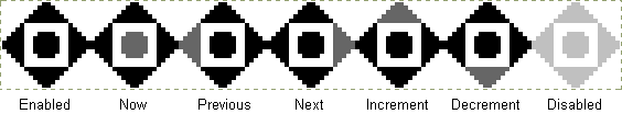 |
| spinnerSize | number[3] | [20, 20, 8] | The dimensions of the spinner image for determining which "button" was clicked. The first two values are the width and height of the individual images, the third is the size of the central button for setting the current time, or 0 for no central button. |
| spinnerBigImage | string | '' | The URL for an expanded spinner image to use, or '' for no expansion.
The layout is the same as for spinnerImage but should
be a larger size. The expanded spinner appears when the user hovers
over the original spinner and disappears when they move off it.Since 1.4.3. |
| spinnerBigSize | number[3] | [40, 40, 16] | The dimensions of the expanded spinner image for determining which "button"
was clicked. The first two values are the width and height of the individual
images, the third is the size of the central button for setting the
current time, or 0 for no central button. Since 1.4.3. |
| spinnerIncDecOnly | boolean | false | Set to true to have only the increment and decrement buttons on the spinner,
or false for all the buttons. |
| spinnerTexts | string[5] | ['Now', 'Previous field', 'Next field', 'Increment', 'Decrement'] | The tooltip text for the spinner buttons. This is one of the regional settings fields. |
| spinnerRepeat | number[2] | [500, 250] | The times in milliseconds for the auto-repeat feature on the increment and decrement spinner buttons. The first value is the initial delay and the second one is the subsequent delay. Hold the mouse button down on these spinner buttons to trigger this feature. Use [0, 0] to disable the auto-repeat. |
| beforeShow | function | null | A function that accepts an input field and returns a settings
object containing new settings for the time entry for this field.
For example, you can use it to set up a time range wherein both
fields restrict the possible values of the other field.
this refers to the input field as well.
Leave as null for no per-field customisation. |
| beforeSetTime | function | null | A function that accepts the old and new times, and minimum and
maximum times, and returns an updated time.
this refers to the associated input field.
This call is made just before the time is updated into the field
allowing for additional restrictions to be applied.
Leave as null for no additional restrictions.Since 1.4.0. |